Analyzing Top Rubik’s Cube Times#
Author: Cyrus Phan
Course Project, UC Irvine, Math 10, F23
Introduction#
For about 7 years at this point, I’ve been very interested in Rubik’s Cubes, and particularly in speedsolving, or speedcubing, in which people compete to solve a puzzle in the shortest time possible. Official times are recorded by the World Cube Association (WCA) in many events, but I will be focusing on the 3x3 event. I would like to analyze patterns in the times of the top performers in the world.
Importing the Datasets and Manipulating Them#
The datasets I will be using are courtesy of this Kaggle post, which is a compilation of the top competitors’ best averages and single solve times until September 5, 2021. Since then, much of this data is outdated, and many records have been broken, but this file should still be a good indicator of patterns of times.
For context, WCA competitions are conducted as such: each round, a competitor does five solves, recorded as a number accurate to three decimal places. The third decimal is truncated, and of the five solves done in the round, the fastest and slowest times are discarded, and the mean of the three remaining times are recorded as the average of that round. This is all to say, the WCA’s use of the terminology, “average” does not mean true mean of five solves. So, from this point forward, when I say, “average”, what I mean is, “average of the three middle times in a round of five solves.” The dataframe averages contains the best result for the top 1000 performers in the 3x3 average category.
Similarly, the dataframe singles contains the best result for the top 1000 performers in the 3x3 single category. That is, the best solve time ever recorded for that competitor throughout any competition.
import pandas as pd
averages = pd.read_csv('best_averages.csv')
singles = pd.read_csv('best_singles.csv')
singles
| Unnamed: 0 | rank | name | time | country | competition | |
|---|---|---|---|---|---|---|
| 0 | 0 | 1 | Yusheng Du (杜宇生) | 3.47 | China | Wuhu Open 2018 |
| 1 | 1 | 2 | Ruihang Xu (许瑞航) | 4.06 | China | Wuhan Open 2021 |
| 2 | 2 | 3 | Feliks Zemdegs | 4.16 | Australia | Auckland Summer Open 2020 |
| 3 | 3 | 4 | Patrick Ponce | 4.24 | United States | Northeast Championship 2019 |
| 4 | 4 | 5 | Nicolás Sánchez | 4.38 | United States | GA Cubers Feet Fest 2019 |
| ... | ... | ... | ... | ... | ... | ... |
| 995 | 995 | 994 | Francis Wong Jia Yen | 7.18 | Malaysia | Melaka Open 2014 |
| 996 | 996 | 994 | Henry Lichner | 7.18 | United States | Wiscube 2019 |
| 997 | 997 | 994 | Mharr Justhinne Ampong | 7.18 | Philippines | UCFO 2017 |
| 998 | 998 | 994 | Sakib Ibn Rashid Rhivu | 7.18 | Bangladesh | City of Joy 2017 |
| 999 | 999 | 994 | Vasilis Vasileris | 7.18 | Greece | Thessalonicube 2016 |
1000 rows × 6 columns
A major component of what I wanted to analyze was the year of each recorded entry, but unfortunately, the dataset did not have a column for year. However, I noticed that, per WCA regulation, year is required after the name of every competition, so if I extract the last four digits of every string in the competition column of averages and singles, I could get the year that each entry was recorded. Also, since there seems to be two spaces before each competition name and one after, I removed the first two digits and the last one from each string in competition for both dataframes.
averages['year'] = averages['competition'].str[-5:-1] #-5 to -1 since there seems to be a space after every year
averages['year'] = pd.to_numeric(averages['year'])
averages['competition'] = averages['competition'].str[2:-1]
singles['year'] = singles['competition'].str[-5:-1]
singles['year'] = pd.to_numeric(singles['year'])
singles['competition'] = singles['competition'].str[2:-1]
averages
| Unnamed: 0 | rank | name | time | country | competition | year | |
|---|---|---|---|---|---|---|---|
| 0 | 0 | 1 | Ruihang Xu (许瑞航) | 5.48 | China | Wuhan Open 2021 | 2021 |
| 1 | 1 | 2 | Feliks Zemdegs | 5.53 | Australia | Odd Day in Sydney 2019 | 2019 |
| 2 | 2 | 3 | Tymon Kolasiński | 5.54 | Poland | LLS II Biała Podlaska 2021 | 2021 |
| 3 | 3 | 4 | Yezhen Han (韩业臻) | 5.57 | China | Guangdong Open 2021 | 2021 |
| 4 | 4 | 5 | Max Park | 5.59 | United States | Houston Winter 2020 | 2020 |
| ... | ... | ... | ... | ... | ... | ... | ... |
| 995 | 995 | 993 | Junze Zhao (赵俊泽) | 9.05 | China | Xuzhou Open 2018 | 2018 |
| 996 | 996 | 993 | Marwan Kamal | 9.05 | Canada | National Capital Region 2019 | 2019 |
| 997 | 997 | 993 | Mattheo de Wit | 9.05 | Netherlands | Hoogland Open 2019 | 2019 |
| 998 | 998 | 993 | Pierre Meunier | 9.05 | France | Elsass Open 2019 | 2019 |
| 999 | 999 | 993 | Zhiyong Liu (柳智勇) | 9.05 | China | Xiamen Autumn 2019 | 2019 |
1000 rows × 7 columns
I also want to analyze data about all listed competitions in the WCA database. However, some WCA competitions last for several days, so the date column contains values which are invalid for conversion into datetime, such as “Aug 28 - 29, 2021” or “Jul 31 - Aug 1, 2021”. Date ranges, as far as I know, cannot be converted into a datetime value, so my strategy is just to extract the first 6 digits in the string and the last four digits, then concatenate them together with a space between to get a proper datetime format.
comps = competitions = pd.read_csv('all_comp.csv')
comps['date'] = comps['date'].str[:6] + ' ' + comps['date'].str[-4:]
comps['date'] = pd.to_datetime(comps['date'])
comps
| Unnamed: 0 | date | name | country | venue | |
|---|---|---|---|---|---|
| 0 | 0 | 2021-09-05 | Flen - Lilla Manschetten 2021 | Sweden, Flen | Aktivitetshuset Skjortan |
| 1 | 1 | 2021-09-04 | SST Naprawa 2021 | Poland, Naprawa | Zespół Szkolno-Przedszkolny w Naprawie |
| 2 | 2 | 2021-09-04 | Flen - Stora Manschetten 2021 | Sweden, Flen | Aktivitetshuset Skjortan |
| 3 | 3 | 2021-08-29 | Chaotic Craigie 2021 | Australia, Perth, Western Australia | Craigie Leisure Centre |
| 4 | 4 | 2021-08-28 | Bologna Back from Holidays 2021 | Italy, Castenaso, Bologna | PalaGioBat |
| ... | ... | ... | ... | ... | ... |
| 7089 | 7089 | 2004-04-03 | Caltech Spring 2004 | United States, Pasadena, California | California Institute of Technology |
| 7090 | 7090 | 2004-01-24 | Caltech Winter 2004 | United States, Pasadena, California | California Institute of Technology |
| 7091 | 7091 | 2003-10-11 | Dutch Open 2003 | Netherlands, Veldhoven | ASML |
| 7092 | 7092 | 2003-08-23 | World Championship 2003 | Canada, Toronto, Ontario | Ontario Science Center |
| 7093 | 7093 | 1982-06-05 | World Championship 1982 | Hungary, Budapest | NaN |
7094 rows × 5 columns
I’d also like to remove rows that have missing values in the venue column.
comps = comps.dropna()
comps
| Unnamed: 0 | date | name | country | venue | |
|---|---|---|---|---|---|
| 0 | 0 | 2021-09-05 | Flen - Lilla Manschetten 2021 | Sweden, Flen | Aktivitetshuset Skjortan |
| 1 | 1 | 2021-09-04 | SST Naprawa 2021 | Poland, Naprawa | Zespół Szkolno-Przedszkolny w Naprawie |
| 2 | 2 | 2021-09-04 | Flen - Stora Manschetten 2021 | Sweden, Flen | Aktivitetshuset Skjortan |
| 3 | 3 | 2021-08-29 | Chaotic Craigie 2021 | Australia, Perth, Western Australia | Craigie Leisure Centre |
| 4 | 4 | 2021-08-28 | Bologna Back from Holidays 2021 | Italy, Castenaso, Bologna | PalaGioBat |
| ... | ... | ... | ... | ... | ... |
| 7088 | 7088 | 2004-04-16 | France 2004 | France, Paris | Novotel Les Halles |
| 7089 | 7089 | 2004-04-03 | Caltech Spring 2004 | United States, Pasadena, California | California Institute of Technology |
| 7090 | 7090 | 2004-01-24 | Caltech Winter 2004 | United States, Pasadena, California | California Institute of Technology |
| 7091 | 7091 | 2003-10-11 | Dutch Open 2003 | Netherlands, Veldhoven | ASML |
| 7092 | 7092 | 2003-08-23 | World Championship 2003 | Canada, Toronto, Ontario | Ontario Science Center |
7076 rows × 5 columns
I also wanted to split the country column to get the country name only, instead of it with the city the competition was hosted in.
comps['trueCountry'] = comps['country'].str.split(',').str.get(0)
comps
/tmp/ipykernel_932/2980643713.py:2: SettingWithCopyWarning:
A value is trying to be set on a copy of a slice from a DataFrame.
Try using .loc[row_indexer,col_indexer] = value instead
See the caveats in the documentation: https://pandas.pydata.org/pandas-docs/stable/user_guide/indexing.html#returning-a-view-versus-a-copy
comps['trueCountry'] = comps['country'].str.split(',').str.get(0)
| Unnamed: 0 | date | name | country | venue | trueCountry | |
|---|---|---|---|---|---|---|
| 0 | 0 | 2021-09-05 | Flen - Lilla Manschetten 2021 | Sweden, Flen | Aktivitetshuset Skjortan | Sweden |
| 1 | 1 | 2021-09-04 | SST Naprawa 2021 | Poland, Naprawa | Zespół Szkolno-Przedszkolny w Naprawie | Poland |
| 2 | 2 | 2021-09-04 | Flen - Stora Manschetten 2021 | Sweden, Flen | Aktivitetshuset Skjortan | Sweden |
| 3 | 3 | 2021-08-29 | Chaotic Craigie 2021 | Australia, Perth, Western Australia | Craigie Leisure Centre | Australia |
| 4 | 4 | 2021-08-28 | Bologna Back from Holidays 2021 | Italy, Castenaso, Bologna | PalaGioBat | Italy |
| ... | ... | ... | ... | ... | ... | ... |
| 7088 | 7088 | 2004-04-16 | France 2004 | France, Paris | Novotel Les Halles | France |
| 7089 | 7089 | 2004-04-03 | Caltech Spring 2004 | United States, Pasadena, California | California Institute of Technology | United States |
| 7090 | 7090 | 2004-01-24 | Caltech Winter 2004 | United States, Pasadena, California | California Institute of Technology | United States |
| 7091 | 7091 | 2003-10-11 | Dutch Open 2003 | Netherlands, Veldhoven | ASML | Netherlands |
| 7092 | 7092 | 2003-08-23 | World Championship 2003 | Canada, Toronto, Ontario | Ontario Science Center | Canada |
7076 rows × 6 columns
The singles and averages dataframes do not have the date for which each result came from, but they do have the competition name. And the competition names are all stored in the comps dataframe. So I can take the dates from the comps dataframe and put them into a new column in singles and averages using the apply method and a lambda function.
Also, since I want to use a few of scikit-learn’s tools, and they do not have built-in support for handling datetime values, I will preprocess the values date column and put them into a new column, called daysSinceMin, which, as the name suggests, gives the number of days that result came from since the very oldest date value in date.
from datetime import datetime
averages['date'] = averages['competition'].apply(lambda x : comps[comps['name'] == x].iloc[0,1])
singles['date'] = singles['competition'].apply(lambda x : comps[comps['name'] == x].iloc[0,1])
averages['daysSinceMin'] = (averages['date'] - averages['date'].min()).dt.days
singles['daysSinceMin'] = (singles['date'] - singles['date'].min()).dt.days
singles
| Unnamed: 0 | rank | name | time | country | competition | year | date | daysSinceMin | |
|---|---|---|---|---|---|---|---|---|---|
| 0 | 0 | 1 | Yusheng Du (杜宇生) | 3.47 | China | Wuhu Open 2018 | 2018 | 2018-11-24 | 2506 |
| 1 | 1 | 2 | Ruihang Xu (许瑞航) | 4.06 | China | Wuhan Open 2021 | 2021 | 2021-06-05 | 3430 |
| 2 | 2 | 3 | Feliks Zemdegs | 4.16 | Australia | Auckland Summer Open 2020 | 2020 | 2020-02-29 | 2968 |
| 3 | 3 | 4 | Patrick Ponce | 4.24 | United States | Northeast Championship 2019 | 2019 | 2019-02-16 | 2590 |
| 4 | 4 | 5 | Nicolás Sánchez | 4.38 | United States | GA Cubers Feet Fest 2019 | 2019 | 2019-12-14 | 2891 |
| ... | ... | ... | ... | ... | ... | ... | ... | ... | ... |
| 995 | 995 | 994 | Francis Wong Jia Yen | 7.18 | Malaysia | Melaka Open 2014 | 2014 | 2014-07-19 | 917 |
| 996 | 996 | 994 | Henry Lichner | 7.18 | United States | Wiscube 2019 | 2019 | 2019-12-21 | 2898 |
| 997 | 997 | 994 | Mharr Justhinne Ampong | 7.18 | Philippines | UCFO 2017 | 2017 | 2017-12-02 | 2149 |
| 998 | 998 | 994 | Sakib Ibn Rashid Rhivu | 7.18 | Bangladesh | City of Joy 2017 | 2017 | 2017-06-03 | 1967 |
| 999 | 999 | 994 | Vasilis Vasileris | 7.18 | Greece | Thessalonicube 2016 | 2016 | 2016-07-30 | 1659 |
1000 rows × 9 columns
Visualizing the Data#
In this section, I will be using Altair to visualize the data.
The first thing I want to do is to visualize the distribution of the fastest single and average solve times in a bar chart. Unfortunately, since the data in time is continuous, I’d like to group the data into bins. For this, I use the cut method of pandas. First, I’ll find the minimum and maximum time values in each dataframe.
import altair as alt
sg = alt.Chart(singles).mark_bar(color='red').encode(
alt.X('time', bin=alt.Bin(maxbins=20)),
alt.Y('count(time)')
)
alt.Chart(averages).mark_bar(color='blue').encode(
alt.X('time', bin=alt.Bin(maxbins=20)),
alt.Y('count(time)')
)
The interpretation of the unusually low counts for the 9.0 binned group in averages is that each dataframe only includes 1000 rows. The actual number of recorded times in that group was cut off.
I’m also interested in what year each competitor’s result came from.
alt.Chart(singles).mark_bar(color='red').encode(
alt.X('year:O'),
alt.Y('count(year)')
)
alt.Chart(averages).mark_bar(color='blue').encode(
alt.X('year:O'),
alt.Y('count(year)')
)
As expected, there are few results from 2017 or earlier; many competitors who still participate in this event are probably still improving their times over the years, and the results from past years would have come from those who are not active anymore. The effect of the COVID-19 pandemic is also very obvious; the upward trend in top times suddenly dipped in 2020 for both averages and singles.
I’d also like to see the trend in the number of competitions per year.
alt.data_transformers.disable_max_rows()
alt.Chart(comps).mark_bar().encode(
alt.X('year(date)', bin=alt.Bin(maxbins=20)),
alt.Y('count(date)')
)
Once again, the effect of the COVID-19 lockdown is obvious. The number of competitions hosted in 2020 and 2021 was much lower than in the years prior.
Now, I would like to see which countries hosted the most cubing competitions.
alt.Chart(comps).mark_bar().encode(
alt.X('trueCountry', sort='-y'),
alt.Y('count(trueCountry):N')
)
len(comps['trueCountry'].unique())
115
Amazingly, the United States has hosted about 1400 competitions, China about 600, and in total, 115 countries around the world have hosted Rubik’s Cube competitions.
Let’s also see if there’s any noticable correlation between the date at which a top result occured and the time result itself.
alt.Chart(singles).mark_circle(color='red').encode(
alt.X('date:T'),
alt.Y('time', scale=alt.Scale(domain=(3.3,7.5)))
)
alt.Chart(averages).mark_circle(color='blue').encode(
alt.X('date:T'),
alt.Y('time', scale=alt.Scale(domain=(5.3,9.2)))
)
There are a few noticable patterns in both graphs. First of all, as before, there is a huge gap in mid-2020, as expected as a result of the pandemic lockdown. The other is that the values seem to not be very concentrated before 2018, since most top competitors are probably still active.
Preciting Times Using Regression Models#
Seemingly, there is no linear correlation between date and time (result), but let’s fit a LinearRegression object to the data for average, using daysSinceMin as the only input feature, and using time as the target, just for curiosity’s sake, then visualize the regression line against the actual data.
from sklearn.linear_model import LinearRegression
singlesReg = LinearRegression()
singlesReg.fit(singles[['daysSinceMin']],singles['time'])
singles['pred_lin'] = singlesReg.predict(singles[['daysSinceMin']])
c1 = alt.Chart(singles).mark_circle(color='red').encode(
alt.X('daysSinceMin'),
alt.Y('time', scale=alt.Scale(domain=(3.3,7.5)))
)
c2 = alt.Chart(singles).mark_line(color='lime').encode(
x='daysSinceMin',
y='pred_lin'
)
c1 + c2
averagesReg = LinearRegression()
averagesReg.fit(averages[['daysSinceMin']],averages['time'])
averages['pred_lin'] = averagesReg.predict(averages[['daysSinceMin']])
c3 = alt.Chart(averages).mark_circle(color='blue').encode(
alt.X('daysSinceMin'),
alt.Y('time', scale=alt.Scale(domain=(5.3,9.2)))
)
c4 = alt.Chart(averages).mark_line(color='orange').encode(
x='daysSinceMin',
y='pred_lin'
)
c3 + c4
from sklearn.metrics import r2_score
r2_score(singles['time'],singles['pred_lin'])
0.00044524837645920634
r2_score(averages['time'],averages['pred_lin'])
0.021245491845280462
As expected, the \(R^2\) value for both models is close to 0, which is terrible. Clearly, a linear regression model would not have been appropriate for this data anyway.
Again, just for fun, we’ll try to perform degree 8 polynomial regression on the data in singles and averages, then plot the results on an Altair chart against the actual data points.
from sklearn.preprocessing import PolynomialFeatures
from sklearn.pipeline import Pipeline
singles_copy = singles.copy()
singles_sub = singles_copy.sample(n=200, random_state=0)
modelSingle = Pipeline([
("poly", PolynomialFeatures(degree=8)),
("reg", LinearRegression())
])
modelSingle.fit(singles_sub[['daysSinceMin']], singles_sub['time'])
singles_copy['pred_poly'] = modelSingle.predict(singles_copy[['daysSinceMin']])
c5 = alt.Chart(singles_copy).mark_line(clip=True, color = 'lime').encode(
alt.X('daysSinceMin'),
alt.Y('pred_poly', scale=alt.Scale(domain=(3.3,7.5)))
)
c1 + c5
averages_copy = averages.copy()
averages_sub = averages_copy.sample(n=200, random_state=0)
modelSingle = Pipeline([
("poly", PolynomialFeatures(degree=8)),
("reg", LinearRegression())
])
modelSingle.fit(averages_sub[['daysSinceMin']], averages_sub['time'])
averages_copy['pred_poly'] = modelSingle.predict(averages_copy[['daysSinceMin']])
c6 = alt.Chart(averages_copy).mark_line(clip=True, color = 'orange').encode(
alt.X('daysSinceMin'),
alt.Y('pred_poly', scale=alt.Scale(domain=(3.3,7.5)))
)
c3 + c6
Once again, as expected, a polynomial regression model is not appropriate for this data.
Classifying Results Using Decision Trees#
Since logistic regression and decisoin trees are methods of classifying, those would be ill-suited for this particular problem. However, there is a chance we can use them (particularly decision trees) for classifying which country a particular competitor is from based on their time and date of result. I predict it will not be very successful, though. I’ll only do this for averages.
from sklearn.model_selection import train_test_split
from sklearn.tree import DecisionTreeClassifier
X_train, X_test, y_train, y_test = train_test_split(averages[['time', 'daysSinceMin']], averages['country'], train_size=0.3, random_state=0)
clf = DecisionTreeClassifier(max_leaf_nodes=3, random_state=2)
clf.fit(X_train, y_train)
DecisionTreeClassifier(max_leaf_nodes=3, random_state=2)In a Jupyter environment, please rerun this cell to show the HTML representation or trust the notebook.
On GitHub, the HTML representation is unable to render, please try loading this page with nbviewer.org.
DecisionTreeClassifier(max_leaf_nodes=3, random_state=2)
clf.score(X_test, y_test)
0.2985714285714286
averages['country'].value_counts()[0]/len(averages)
0.23
Unsurprisingly, the prediction score is quite poor. It is better than guessing the most commonly occuring country (United States), however. Let’s visualize the decision tree.
import matplotlib.pyplot as plt
from sklearn.tree import plot_tree
fig = plt.figure(figsize=(20,10))
_ = plot_tree(clf, feature_names=clf.feature_names_in_, filled=True)
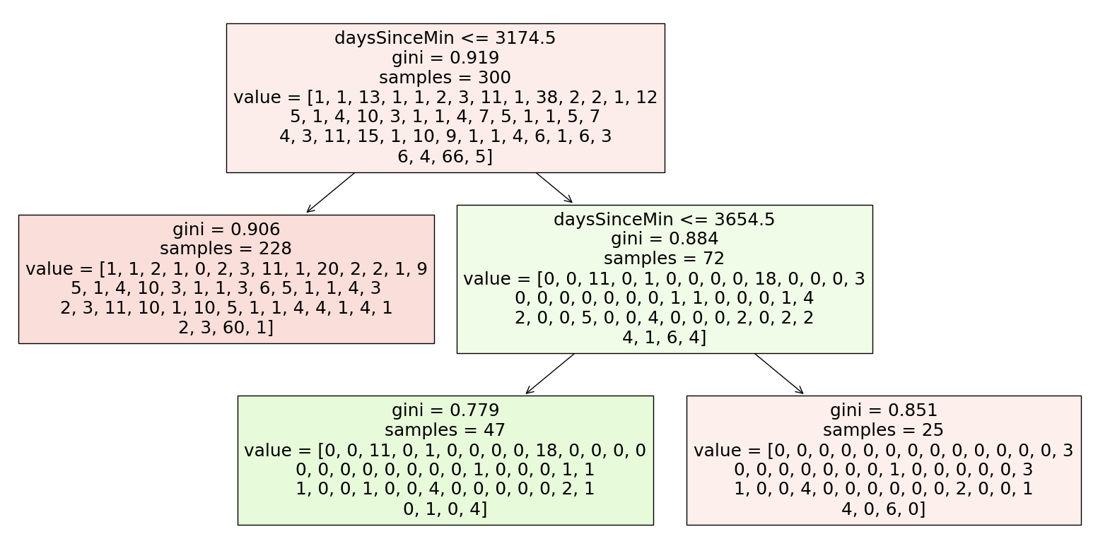
clf.classes_
array([' Algeria ', ' Argentina ', ' Australia ', ' Austria ',
' Belarus ', ' Bolivia ', ' Brazil ', ' Canada ', ' Chile ',
' China ', ' Colombia ', ' Denmark ', ' Finland ', ' France ',
' Germany ', ' Hong Kong ', ' Hungary ', ' India ',
' Indonesia ', ' Iran ', ' Israel ', ' Italy ', ' Japan ',
' Malaysia ', ' Mexico ', ' Mongolia ', ' Netherlands ',
' New Zealand ', ' Norway ', ' Peru ', ' Philippines ',
' Poland ', ' Portugal ', ' Republic of Korea ', ' Russia ',
' Singapore ', ' Slovenia ', ' Spain ', ' Sweden ',
' Switzerland ', ' Taiwan ', ' Turkey ', ' Ukraine ',
' United Kingdom ', ' United States ', ' Vietnam '],
dtype=object)
Seemingly, the decision tree is only predicting United States and China, which is expected since those two are the most commonly occuring countries. And the decision tree is only creating decision boundaries perpendicular to the axis representing daysSinceMin.
As for the discussion about overfitting; I believe that the minimum value for the U-shaped test error curve will be quite high no matter how we split our testing and training data. I find that there is very little visible correlation between time, date, and country, meaning a decision tree is also relatively useless in the problem of classifying. Perhaps if I had access to information about which hardware (cube) was used to achieve each result, there would be an emerging pattern based on the popularity of certain products in certain countries, but that data is unfortunately not logged on the WCA database.
Generating a Random Set of Times#
Although our previously discussed methods of regression and classifying are ineffective with this dataset, one pattern which is almost certainly true is that the solve time data is normally distributed, or at least approximately normal. We unfortunately do not have access to the full WCA database with every single competitor’s fastest single solve time, so we cannot calculate the mean and standard deviation.
However, my idea is this: I will see how many total competitors have participated in the 3x3 Rubik’s Cube event in the entire history of the WCA, then generate a random set of mock times following the Gaussian curve. I will play around with the mean and standard deviation parameters until I get data that vaguely matches our real data from the top 1000 results, then extrapolate to hopefully predict the real mean and standard deviation, or at least draw some conclusions about every top single 3x3 result.
First, I’ll define a function which takes two inputs, mean and std, and uses them to generate a random set of 200000 values (I chose 200000 because that is the total number of competitors in the WCA 3x3 event, per their website). I’ll make a dataframe from those randomly generated times, then filter out the results greater than 7.3 and less than 3.4 to more easily visualize the mock data side-by-side with the real data.
import numpy as np
def random_times(mean, std):
data_points = np.random.normal(mean, std, 200000)
df = pd.DataFrame({'time': data_points, 'mock': 'Mock'})
filtered_df = df[(df['time'] <= 7.4) & (df['time']>= 3.4)]
return filtered_df
single_copy = singles.copy()
Since my goal is to create some Altair charts, I’d like to separate the mock data from the real data, hence the code below. Then I concatenate the mock data and the real data to get resultdf.
single_copy['mock'] = 'Real'
resultdf = pd.concat([single_copy, random_times(15.1,3.05)], ignore_index=True)
I played around with a few values for mean and std, and landed on 15.1 and 3.05 respectively, which I found was similar enough to the real data.
Finally, to put the two histograms side-by-side to compare them:
alt.Chart(resultdf).mark_bar(color='red').encode(
alt.X('time', bin=alt.Bin(maxbins=20)),
alt.Y('count(time)'),
color='mock:N',
column='mock:N'
)
The mock data looks quite similar to the real data, other than the fact that, among other things, there are less leftmost values for the real data. So, given the similarity in the histograms, I will conclude (without rigor) that the mean top single solve time for all competitors in the WCA is 15.1, with standard deviation 3.05. How does this compare to the actual data?
I decided to search on the WCA, and found that the median value was approximately 21.8. This is quite far off from our predicted value of 15.1! But this does not necessarily mean the worst; we can still conclude that the distribution of single solve times is not perfectly normal. The suggestion is that the distribution of solve times is actually right-skewed, which makes sense logically; there is a very high likelihood of there being outliers on the right extreme (solve times that are more than a minute long).
Summary#
First, I did a lot of cleaning data so that I could then visualize it, mainly using Altair. After doing some data visualization, I tried applying some of the regression and classifying tools that we learned in the latter weeks of class, but was unfortunately unsuccessful based on the fact that there was little visible correlation between the variables I was analyzing. But even though those trials were not fruitful, I used some random generation of normal data to conclude that the distribution of Rubik’s cube solve times is right-skewed, which is consistent with the actual data provided by the WCA.
References#
Your code above should include references. Here is some additional space for references.
What is the source of your dataset(s)? https://www.kaggle.com/datasets/patrasaurabh/evolution-of-rubiks-cube-solve-times
List any other references that you found helpful.
https://www.kaggle.com/code/suharkov/evolution-of-rubik-s-cube-eda: This analysis of the same dataset that I was working with gave me a good headstart of what statistics to look at.
https://openscoring.io/blog/2020/03/08/sklearn_date_datetime_pmml/#:~:text=A datetime is a complex,be fed to Scikit-Learn: This is where I learned that I should preprocess the datetime data to work with sklearn.
https://altair-viz.github.io/altair-tutorial/notebooks/03-Binning-and-aggregation.html: This is where I learned to do binning in Altair.
https://www.worldcubeassociation.org/results/rankings/333/single: The WCA, which I referenced numerous times in the project. They provided all the data for this project.